
Colors have a powerful influence on the way we perceive the world. When used in marketing your coaching services, different colors can impact the way clients perceive you, even in the most subtle ways. A study published in the journal Management Decision shows that people make decisions within 90 seconds of their first impression of a product, and color alone contributes up to 90 percent of the information that forms the decision.
Not sure what color scheme you should use for your coaching services? A good place to start is to consider your target audience. What are they feeling when they visit your website? How might they feel differently after visiting your website?
There are lots of online resources that delve into the psychology of color for web design and branding. Here are a few of my favorites:
- The Psychology of Color in Web Design
- Color Psychology in Marketing and Branding is all about Context
Before I show you excellent example color schemes for coaching websites, below are a few concrete color considerations for specific target coaching niches.
Life Transitions
Coaches who help clients through life transitions, especially difficult ones, will want a soothing color scheme. Clients coming to them for help will most likely be feeling sad and anxious. The colors should be a bit more muted, but not too dark either. Blue, green, purple, and pink are good choices because they are peaceful and yet hopeful. Bright colors signal joy, playfulness, and whimsy and should be avoided unless they are used in very small amounts or in distinct calls to action.
Dating and Intimacy
Coaches that work with clients in the areas of dating and intimacy can have fun with pops of bolder and brighter colors. Red signals love, desire, and action. Many dating coaches for women use bright pink shades. Clients coming to a dating coach may feel a bit defeated already but want to feel excited, hopeful, and ready to take action.
Parenting and Kids
Parent Coaches who help moms and dads deal with parenting their kiddos, can be versatile when it comes to color. While clients may be feeling uncertain or anxious when they visit a parent coach website, most ultimately want to hire someone who understands children and how to help with their adjustment and happiness. Particularly when targeting parenting solutions for younger kids, colors can be bright, playful, and cheery. Yellow, orange, bright blue and green, red and purple, or a combination of all can work well.
Fitness and Adventure
Coaches that help clients with fitness goals and going on adventures can have a much different color scheme than other coaches. Dark colors like black and grey or a combination of dark and light work well. To highlight certain words or calls to action, bright colors such as red, yellow, or orange can be used.
Some of my favorite color schemes for coaching websites…
Patrice Washington
Finance Coach
This website uses a color scheme that exudes luxury and wealth. As a finance coach, this color scheme speaks well to her audience and provides credibility for her services.
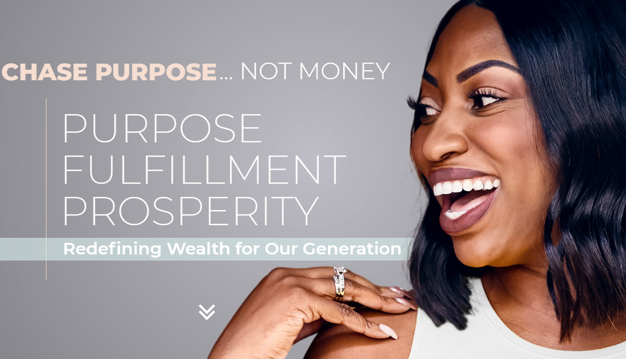
Big Stone
#2c4049
Oyster Bay
#d8eeed
Sandrift
#AE8E77
Pot Pourri
#f6ded1
Dorothy AB Johnson
Breakup Coach
This website uses a soft, feminine color scheme that is professional and inviting. It’s a great color scheme for a coach whose target audience is women moving through transitions back to single life.
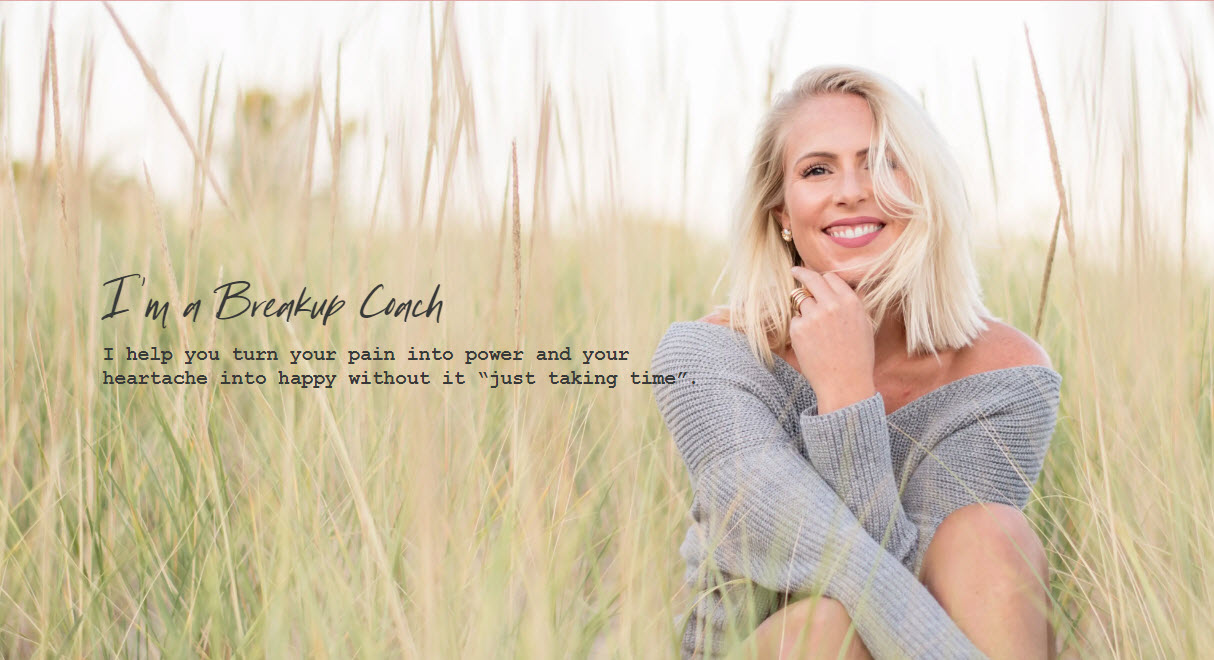
Shilo
#e0aaaa
Bianca
#f5f1e3
Vulcan
#343840
Tahuna Sands
#d1c59c
Anastasia Gerali
Spiritual Coach
This website uses a color scheme that combines warm and cool tones. As a spiritual coach, this color scheme works as it provides a feeling of intrigue and duality. For buttons and calls to action, she uses a punchier pink color to draw attention to take action.

Horizon
#5D8091
Tobacco Brown
#715843
Light Coral
#EB8585
Hawkes Blue
#D9DFE7
Souliciously Hanna
Nutrition Coach
This website uses pops of bold and bright colors that are meant to get your attention. As a nutrition and mindset coach, this color scheme works because the colors mimic the kinds of healthy, organic foods she is encouraging her clients to eat.
Sunglow
#f8da66
Radical Red
#FF3659
Eastern Blue
#03989E
Tango
#D77635
Kimberley Sherwood
Executive Non-Profit Coach
This website uses a color scheme that has fun, yet professional colors. As an executive non-profit coach, the color scheme works because it inspires optimism, creativity, and warmth. Calls to action are set in bolder colors and highlighted titles and words are in blue.
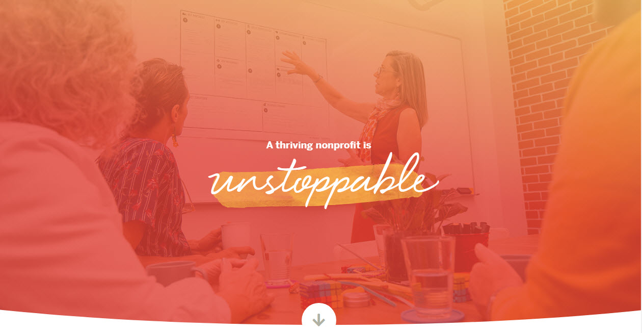
Flamingo
#E4574F
Gothic
#64898d
Casablanca
#EDB65D
Floral White
#f8f6f2
The Great Relate
Parenting Coach
Nothing says “my subject matter is kids” better than a color scheme with lots of bright color pops. Lara Postma, parenting coach, balances her bright colors with plenty of white space and a more muted grey.

Tory Blue
#38499f
Outrageous Orange
#f16036
Dandelion
#f5d561
Alice Blue
#F1F2F3